Have you ever wondered why your favorite movies or photos look so captivating? The secret lies in color correction and color grading. These two steps can completely transform the mood, tone, and vibe of an image or video.
In this article, we’ll break down color grading vs color correction, explore their differences, and show you the best editing software to achieve professional results.
Table of contents
- What Is Color Correction?
- What Is Color Grading?
- Color Correction vs Color Grading: Key Differences
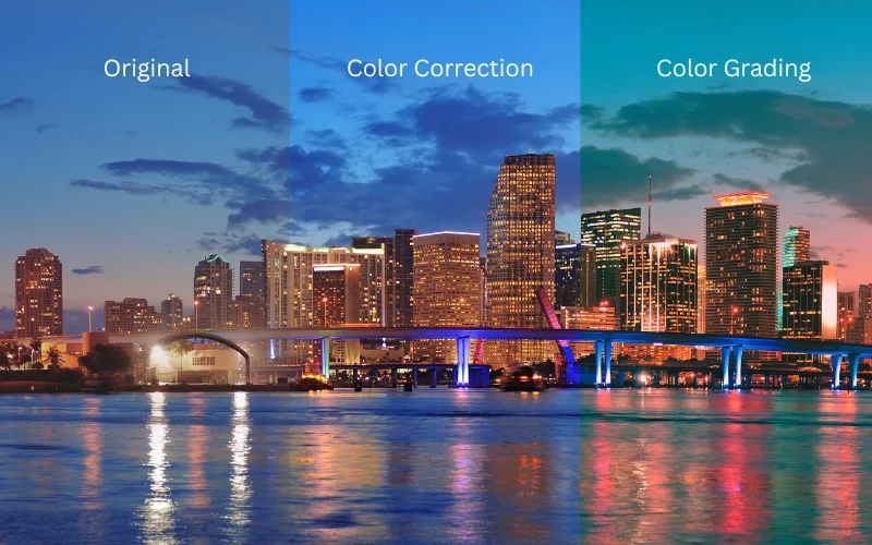
- Examples Of Color Grading & Color Correction
- 5 Best Color Correction Software Used By Professionals
- 5 Best Color Grading Software Used By Professionals
- When to Use Color Correction or Color Grading
- How to Combine Both in Your Editing Workflow
- Common Mistakes to Avoid
- Conclusion – Color Grading vs Color Correction
- Frequently Asked Questions
What Is Color Correction?
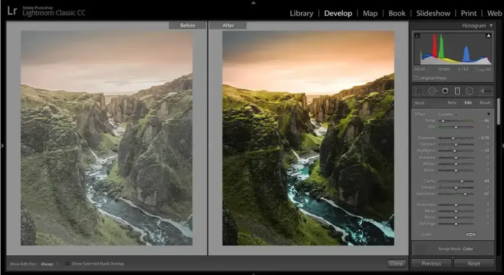
Color correction is the process of adjusting and balancing the colors in a photo or video to make them appear natural and true to life. The main goal is simple. You want the colors in your footage to match what your eyes see.
When you capture something indoors or in mixed lighting, your image may look too warm or too cool. Color correction helps fix it by adjusting brightness, contrast, exposure, white balance, and overall color balance. It is like tuning your TV until the picture finally looks right.
For example, if your shot looks too blue, color correction can add the right amount of warmth. If the highlights appear blown out or the shadows are too dark, you can adjust those values to restore detail.
What Is Color Grading?
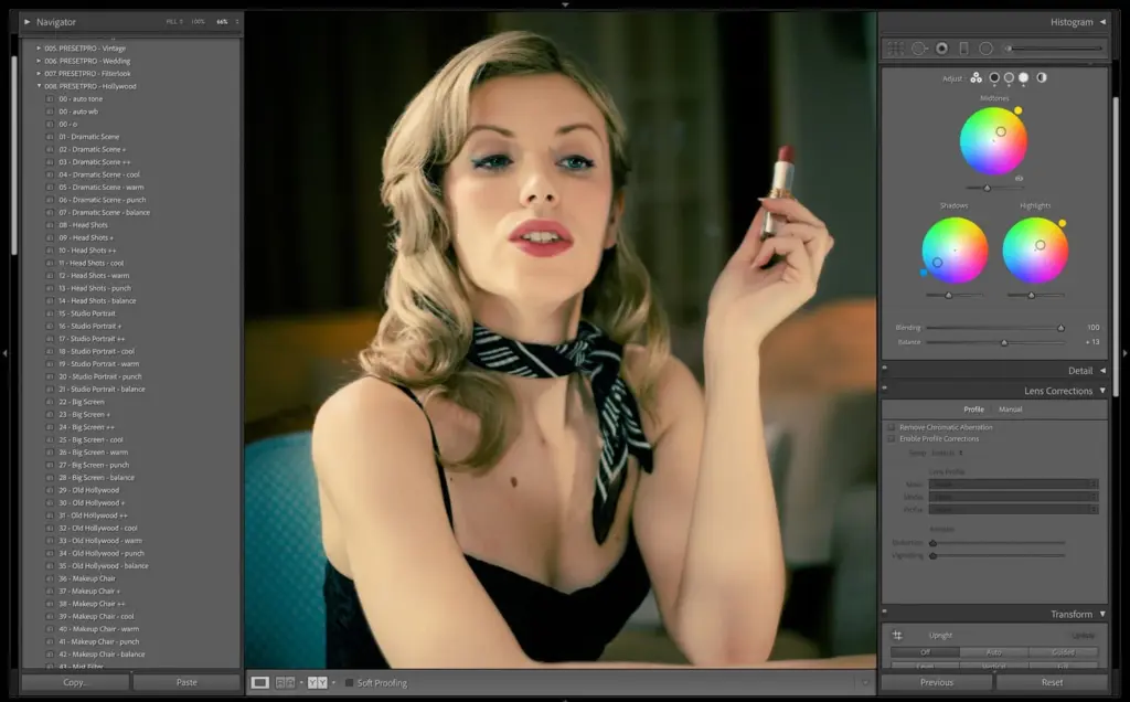
Color grading is the part of editing where you give your visuals their final look and mood. Once the colors in your photo or video are corrected, grading lets you add style and personality.
It is basically the step that takes something clean and turns it into something eye-catching. Think of your raw footage as a plain drawing. Color grading is the step where you choose the colors that bring the drawing to life.
You can add warmth to the image to make it feel cozy or nostalgic. Cool it down to give it a calm or serious vibe. Add more contrast to create a dramatic photo. Small changes can completely shift how a viewer feels.
On the technical side, color grading focuses on three main controls. Hue is the actual color. Saturation decides how strong that color looks. Brightness controls how light or dark everything appears. By adjusting these three elements, you can shape almost any style you want.
Color Correction vs Color Grading: Key Differences
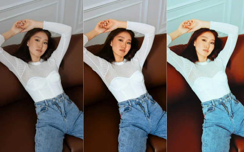
Both color correction and color grading are essential parts of the photo editing process, yet they serve very different purposes.
To make it clearer, here’s a side-by-side comparison of the two.
| Color Correction | Color Grading |
|---|---|
| Fixes technical issues in color, exposure, and white balance. | Adds style, mood, and personality to the visuals. |
| Makes the image look natural and true to life. | Makes the image look cinematic, artistic, or emotionally driven. |
| Focuses on accuracy and consistency. | Focuses on creativity and storytelling. |
| Adjusts brightness, contrast, white balance, and basic color balance. | Adjusts hue, saturation, brightness, and overall color mood. |
| Removes unwanted tints like too blue or too warm tones. | Creates intentional looks like warm, cool, dramatic, or vintage. |
| Aims for realism and neutrality. | Aims for impact, emotion, and visual identity. |
| Done with tools like Photoshop, Lightroom, Premiere Pro, and DaVinci Resolve. | Done with color wheels, LUTs, and advanced grading tools like DaVinci Resolve color grading. |
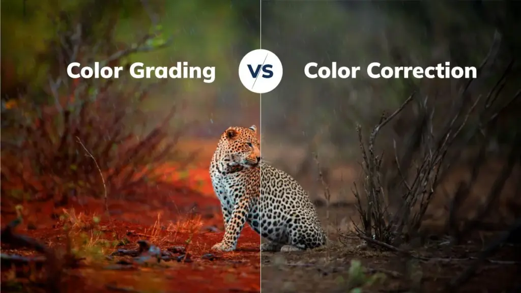
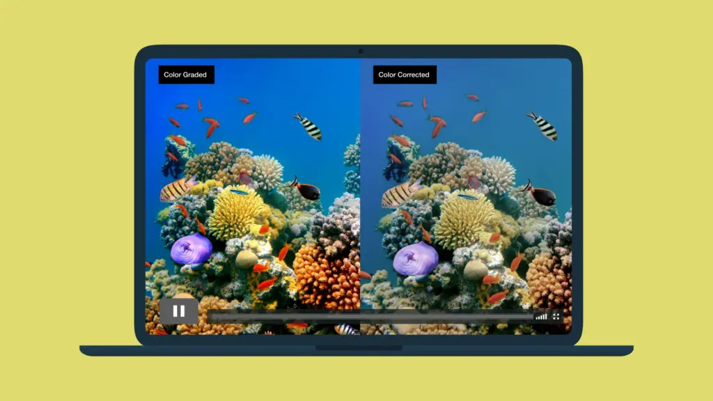
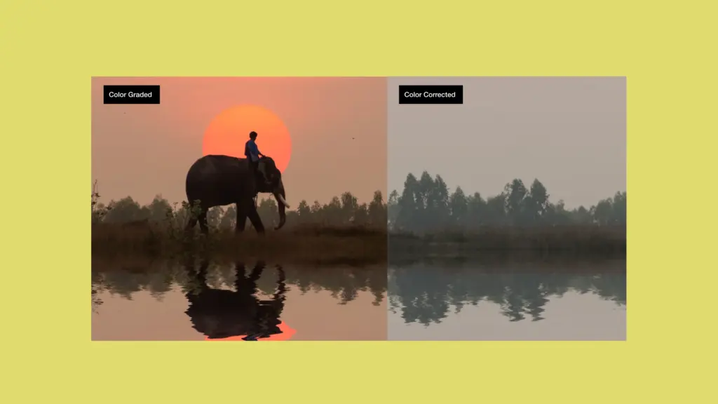
Examples Of Color Grading & Color Correction
5 Best Color Correction Software Used By Professionals
1. Adobe Photoshop
A powerhouse for color correction, Photoshop offers tools like Curves, Levels, Color Wheels, Color Balance, and Selective Color.
You can fine-tune individual color channels, correct color casts, and make very precise adjustments to hue, saturation, brightness, and contrast.
2. Adobe Lightroom
Lightroom is ideal for organizing and batch editing. It makes it easy to correct exposure, white balance, and color tone across many images.
It is especially useful for photographers who want both speed and control.
3. Capture One
This is a more professional-grade tool known for high precision color management. It is excellent for working with RAW files and gives you very fine control over color corrections.
4. Photopea
A browser-based, budget-friendly editor that feels a lot like Photoshop. Photopea supports adjustment layers, so you can adjust brightness, contrast, saturation, and more without installing software.
5. Lunapic (Online Tool)
Lunapic is a free web editor that lets you adjust hue, saturation, brightness, etc. It even uses curves for detailed tonal control. No signup or download is required.
5 Best Color Grading Software Used By Professionals
1. DaVinci Resolve
This is a professional-grade photo and video color correction software by Blackmagic Design, featuring a full color correction and grading system. With DaVinci Resolve, you get powerful node-based workflows, advanced controls for hue, saturation, and contrast, and visual effects capabilities. It is preferred by professionals for color grading.
2. Adobe Photoshop
Photoshop supports creative color grading. You can apply gradients, adjustment layers, hue/saturation controls, and blending modes to add a mood or style to images.
3. Red Giant Colorista
This is a highly specialized color grading tool commonly used in video editing. It provides three-way color correction (shadows, midtones, highlights), curve adjustments. It also has very flexible controls for cinematic looks.
4. Adobe Premiere CC / Pro
Premiere Pro offers grading functionality through its Lumetri Color panel. It lets you adjust exposure, contrast, color balance, and apply stylized LUTs.
5. Final Cut Pro X
Final Cut Pro X has pro-level color wheels, curves, and selective color adjustment. It is perfect for Mac users.
When to Use Color Correction or Color Grading
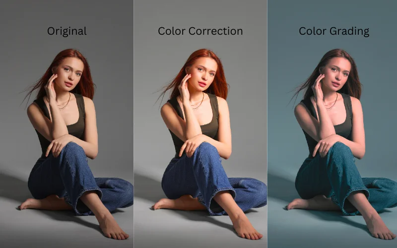
To understand the difference between color grading & color correction a little better, let’s look at some scenarios where you’d use these techniques.
| Color Correction | Color Grading |
|---|---|
| Fixing white balance issues (too warm or too cool) | Creating a cinematic or stylized look |
| Correcting exposure (too dark or too bright) | Adding mood or emotional tone to a scene |
| Adjusting contrast to make the image look natural | Applying LUTs for creative styles |
| Fixing unnatural skin tones | Giving a signature aesthetic or brand look |
| Matching shots from different cameras | Adding drama, warmth, or coolness |
How to Combine Both in Your Editing Workflow
1. Finish Structural Editing First
Before you correct or grade, make sure your edit is “locked.” Do all the cutting, trimming, and structural edits first. That way, your color work applies to the final version.
2. Start with Color Correction
Fix exposure, white balance, contrast, and consistency across shots. This is your cleanup stage, where you make everything look balanced.
3. Apply Creative Grading
Once you balance & edit videos, move on to color grading. Use tools like color wheels, curves, and LUTs (Look-Up Tables) to shape your overall mood or aesthetic.
Think about the emotional tone you want to convey: warm, cool, dramatic. And use grading to apply that vision to your image.
4. Use Adjustment Layers or Nodes
Use software like Premiere Pro or DaVinci Resolve to apply your grading on separate layers or nodes. This keeps your original photo intact and makes it easier to refine.
5. Check With Scopes and Refine
Review your work with scopes to make sure skin tones, shadows, and highlights look right. Then make small tweaks until everything feels cohesive.
Common Mistakes to Avoid
Color Correction Mistakes
1. Using contrast incorrectly
Making contrast too high can crush shadows or blow out highlights, making your image lose important details. Too little contrast makes the photo look flat and dull. The goal is to find a natural balance that keeps depth without hurting image quality.
2. Over-saturation
Adding too much saturation can make colors look unrealistic. Skin tones especially start to look unnatural very quickly. A slight boost is fine, but oversaturating often ruins the overall mood and professionalism of the photo.
3. Overusing the vignette effect
A subtle vignette can draw attention to your subject, but a heavy one looks distracting and unprofessional. Dark corners should not overpower the main image. Use vignettes carefully, only when they truly enhance the photo.
Color Grading Mistakes
1. Starting with poorly shot footage
Grading becomes much harder if the original footage is underexposed, blown out, or not captured in a flat profile. You’ll struggle to pull detail back, and your final look won’t be as clean or flexible.
2. Choosing colors that don’t work together
Applying tones without understanding basic color harmony often leads to strange, clashing, or unrealistic results. A good grade should enhance the story, not distract with odd color choices.
3. Pushing the grade too far
Heavy LUTs, extreme saturation, or excessive contrast can make skin tones look orange or artificial. When the grade becomes louder than the content, it pulls viewers out of the scene. Subtle adjustments usually look more professional.
Conclusion – Color Grading vs Color Correction
That wraps up everything you need to know about video & photo color correction vs color grading.
We hope this guide helped clear up the differences between these two essential techniques and inspired you to try them out on your own projects.
Frequently Asked Questions
1. How many types of color grading are there?
The main types of color grading include primary color grading, which adjusts the overall color and contrast of the entire image. Secondary color grading which focuses on specific areas or colors within a scene. Creative color grading, where you add artistic styles and moods. Log grading, used to enhance flat, low-contrast footage.
And LUT-based grading, which applies preset looks to quickly achieve a certain style.
2. What is AI color grading?
AI color grading is a process where AI is used to analyze and adjust the colors in photos or videos. It speeds up the process by applying smart corrections and creative looks based on learned patterns. This makes it easier to achieve professional results even without technical knowledge.
3. Is color grading and color correction hard?
Not really. Color grading and color correction can seem hard at first, but with practice, they get easier.
4. What is DaVinci Resolve?
DaVinci Resolve is a popular software used for color grading. It’s known for its powerful features that let you fix colors, add creative looks, and edit videos all in one place.
Many professionals use it for color grading as it offers high-quality features. And there’s also a free version that’s great for beginners.
5. Can I do color correction in Photoshop?
Yes, you can do photo color correction in Photoshop. It has tools to adjust brightness, contrast, white balance, and colors to make your photos look more natural and balanced.
6. How to learn color grading?
Start with online tutorials: There are free and paid video courses for Lightroom, Photoshop, and DaVinci Resolve. You can also check out this bundle: 10-in-1 Tutorials To Master Color Grading & Creative Photo Editing
